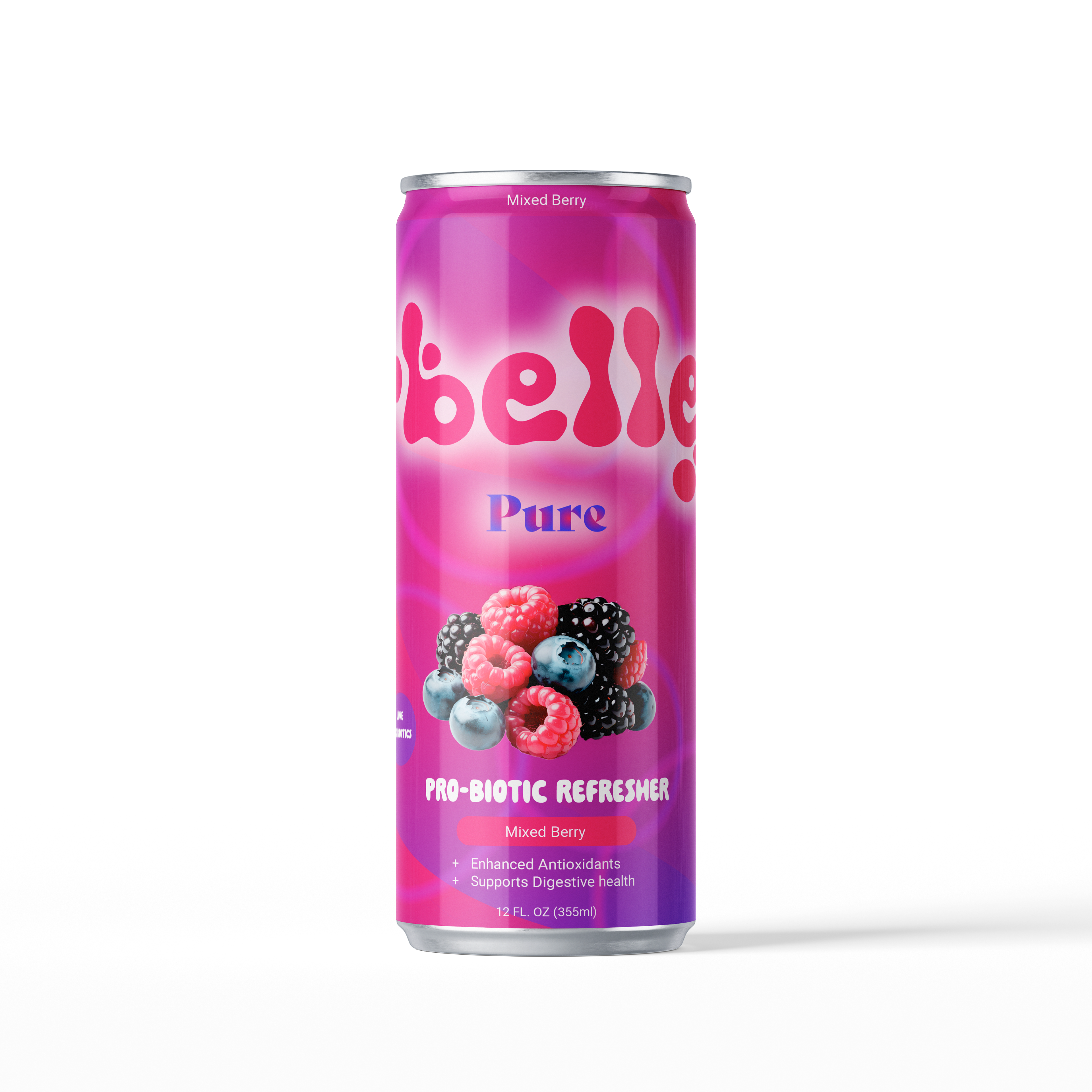
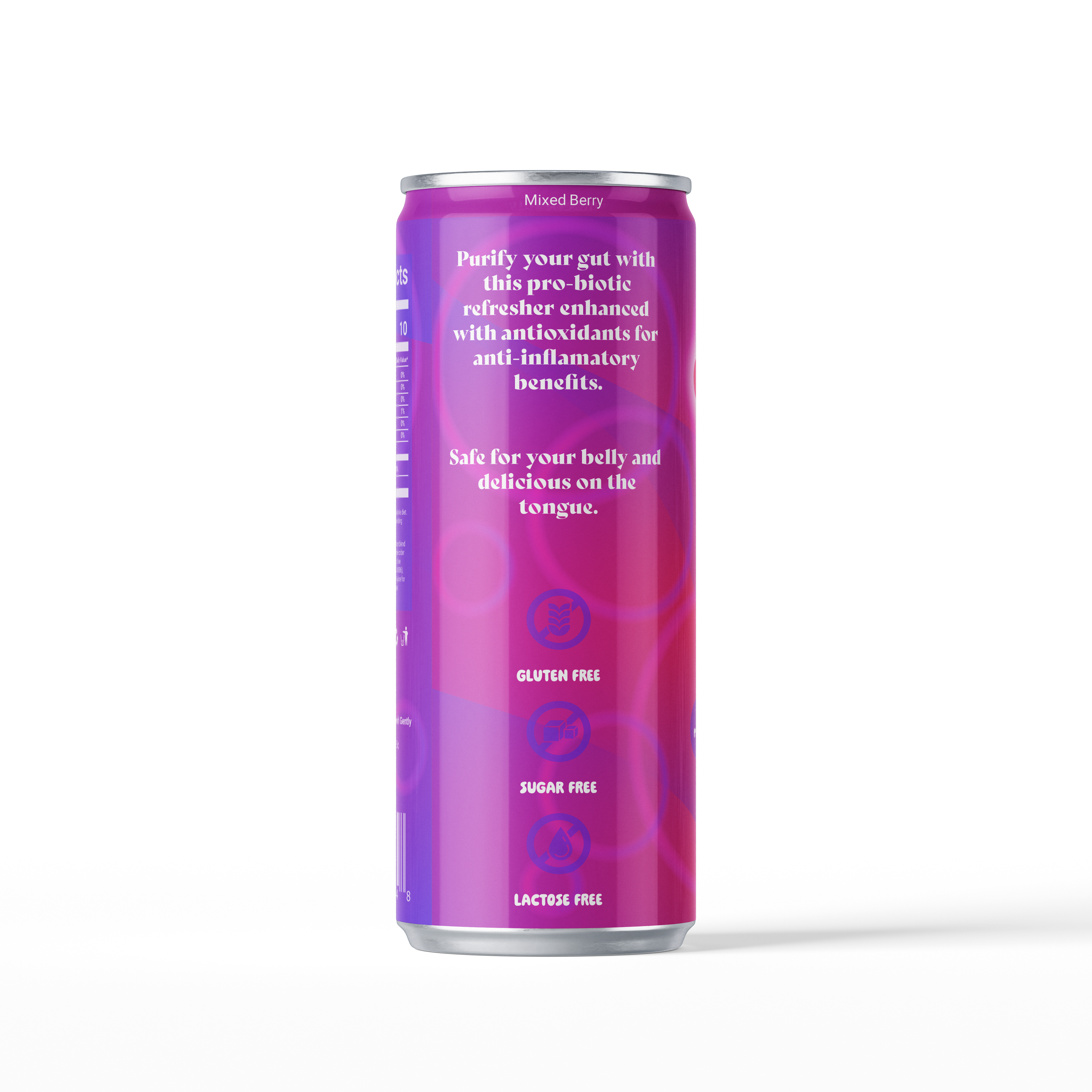
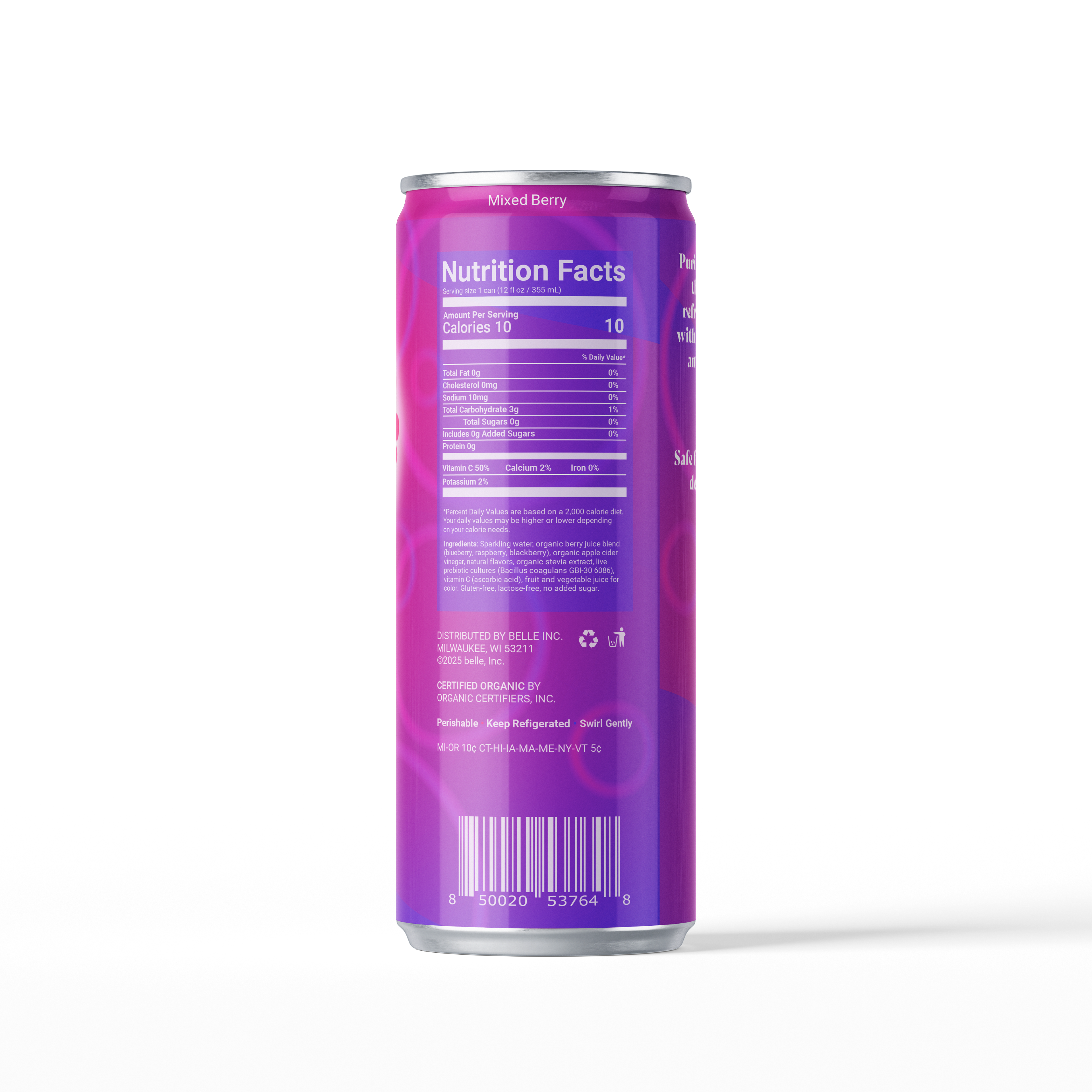
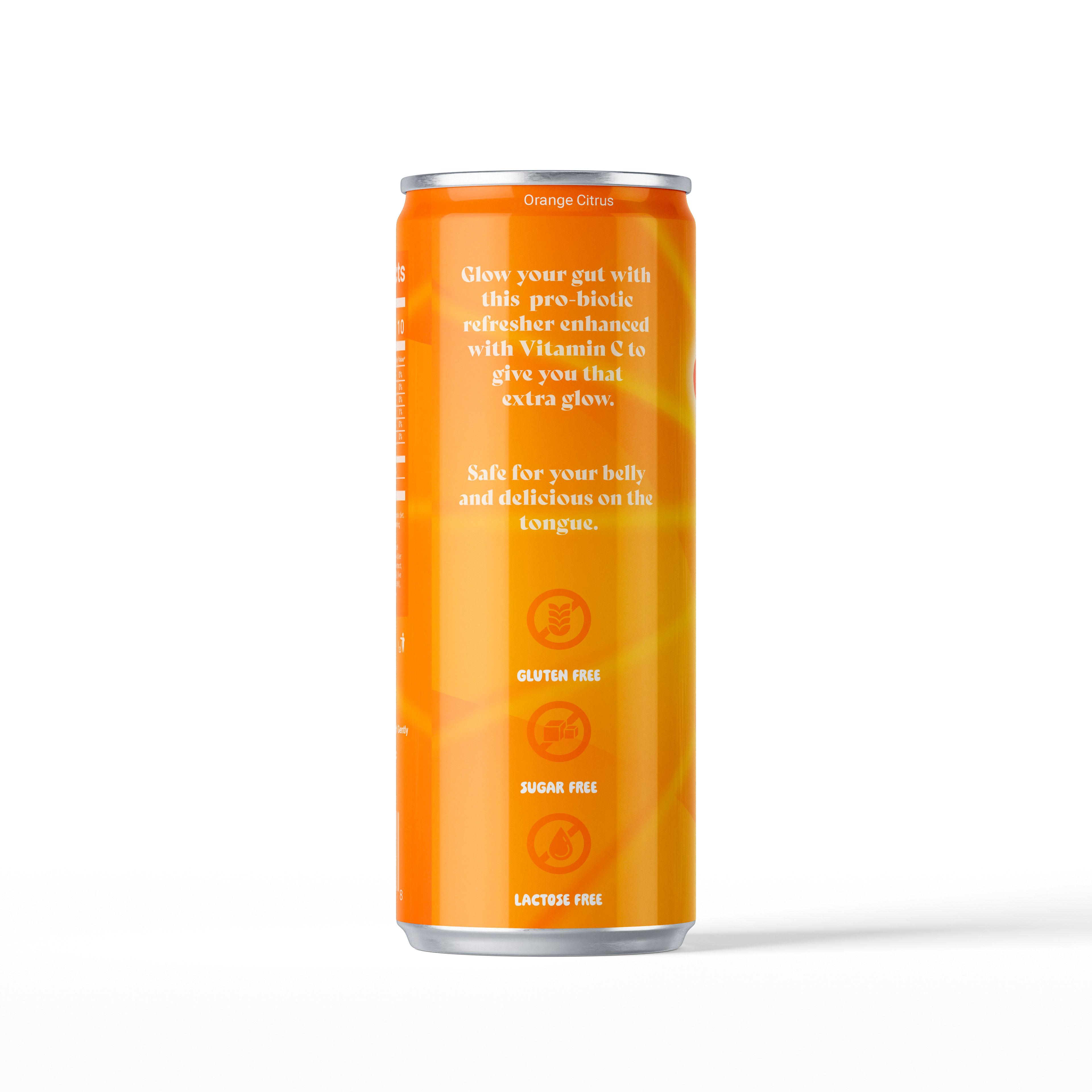
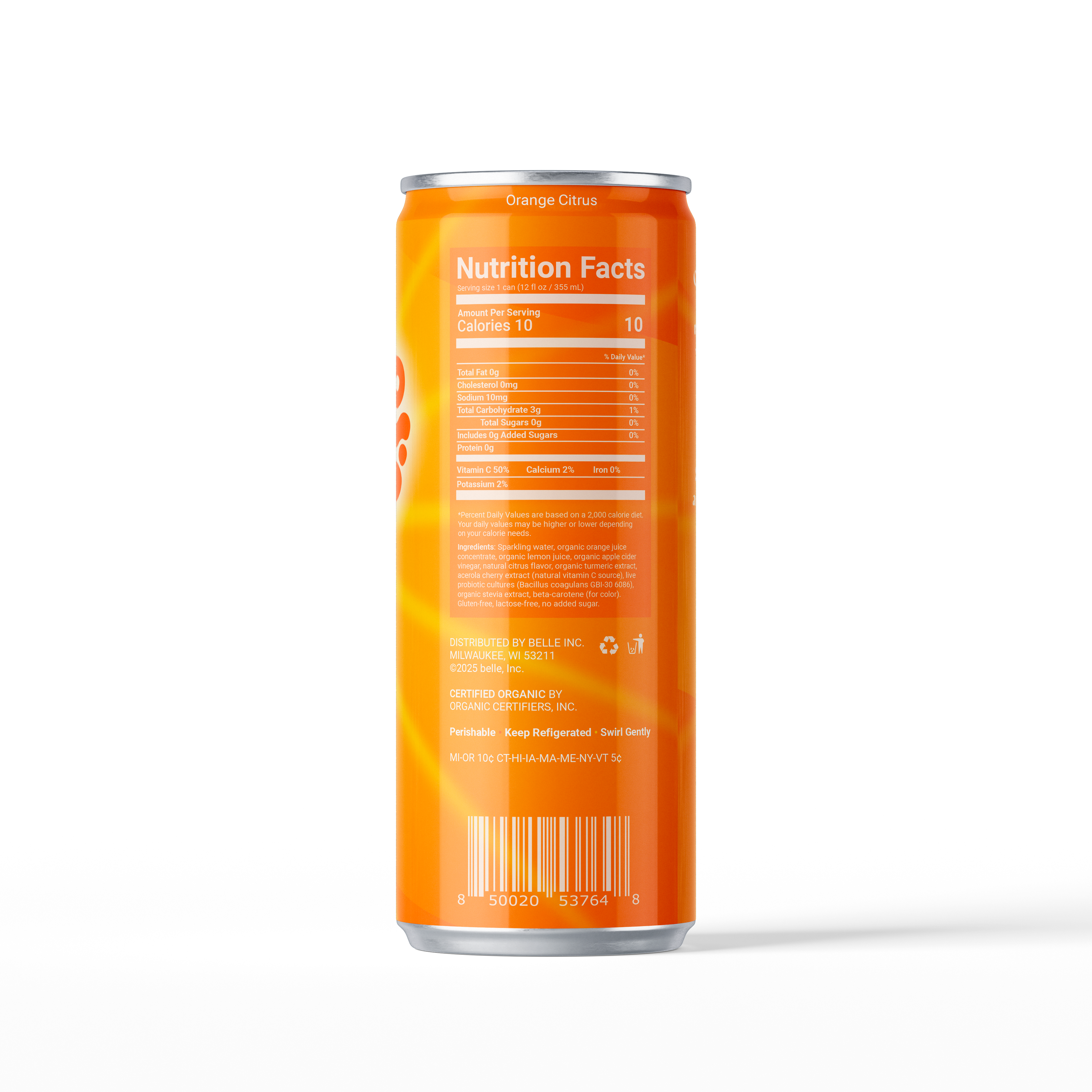
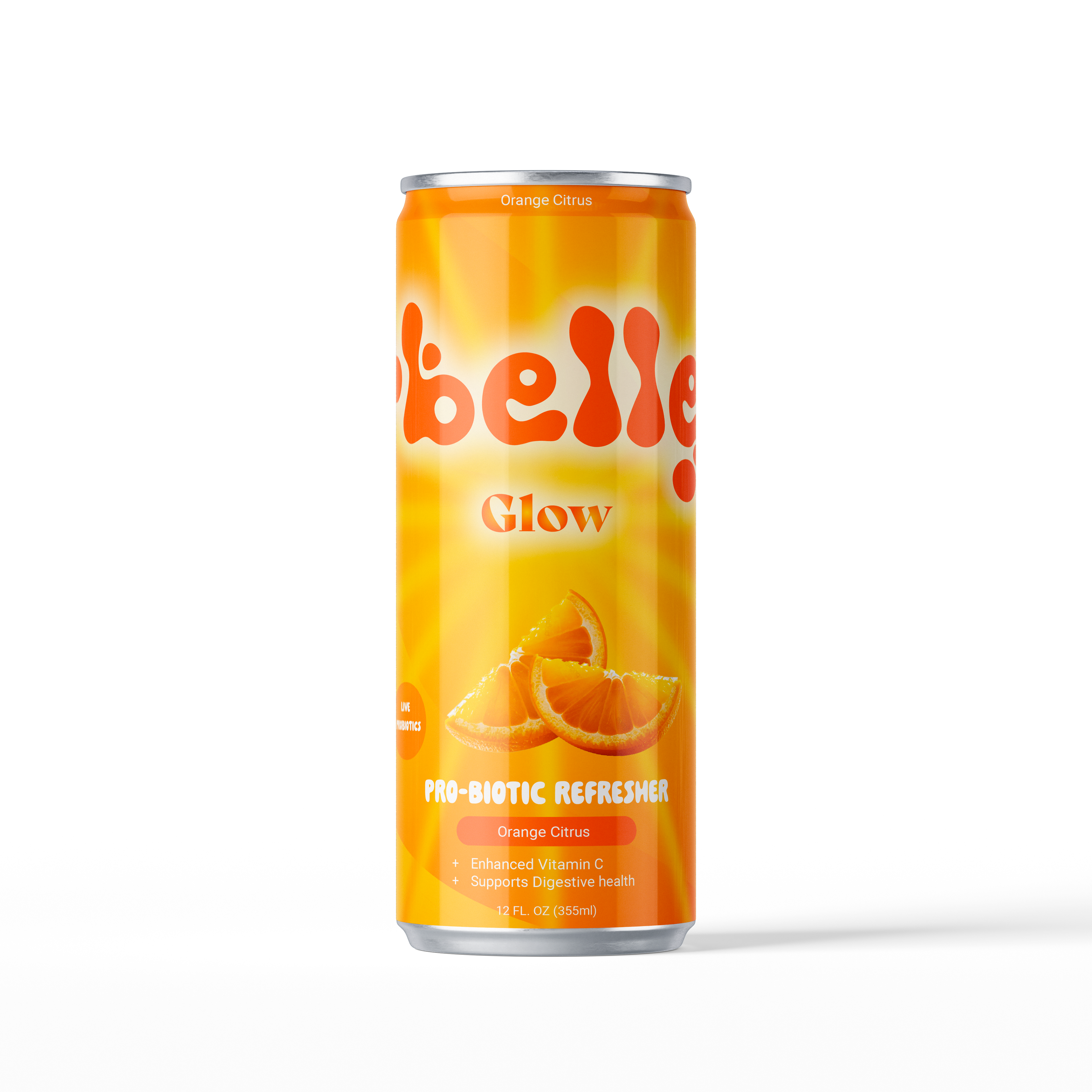
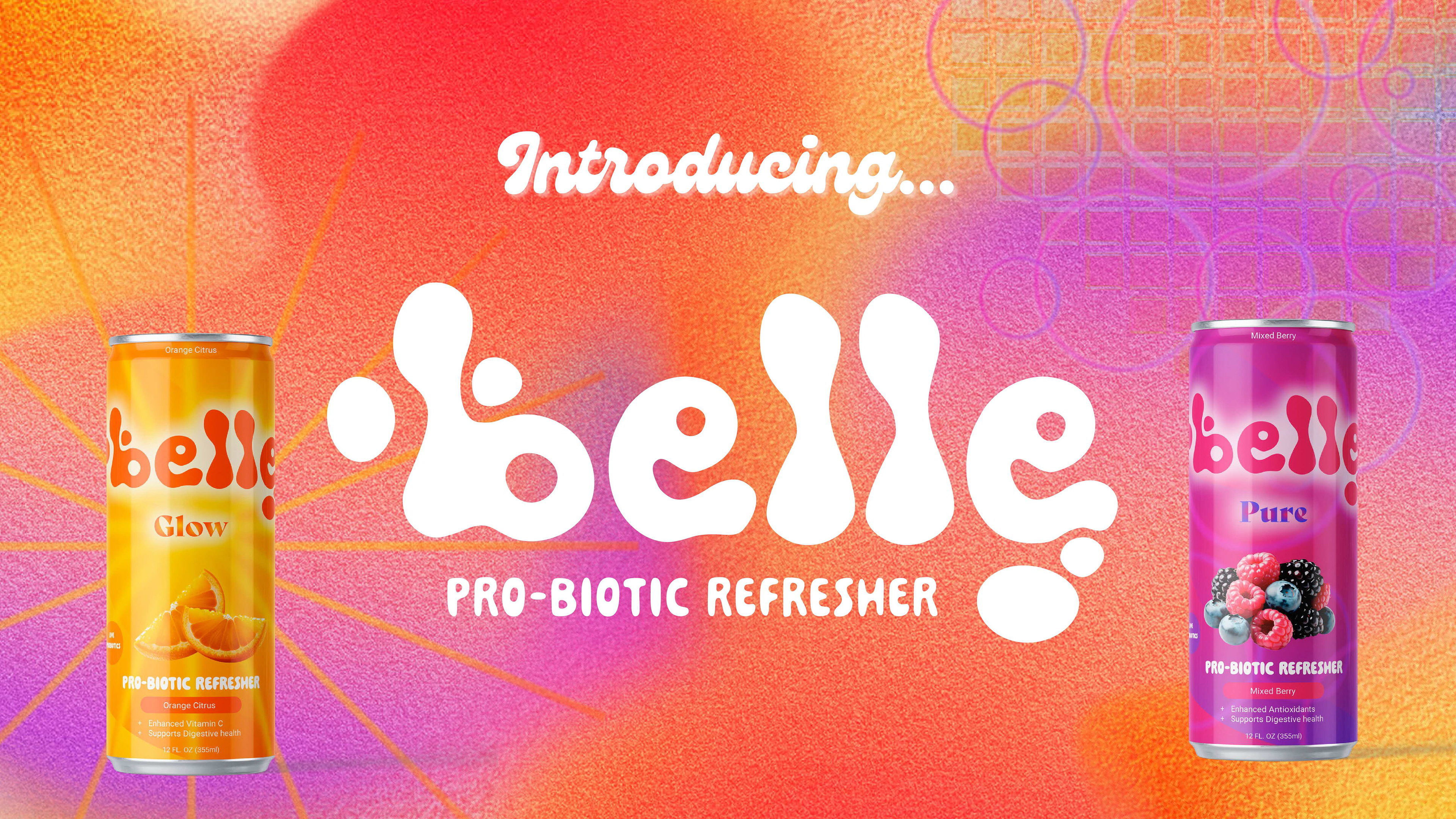
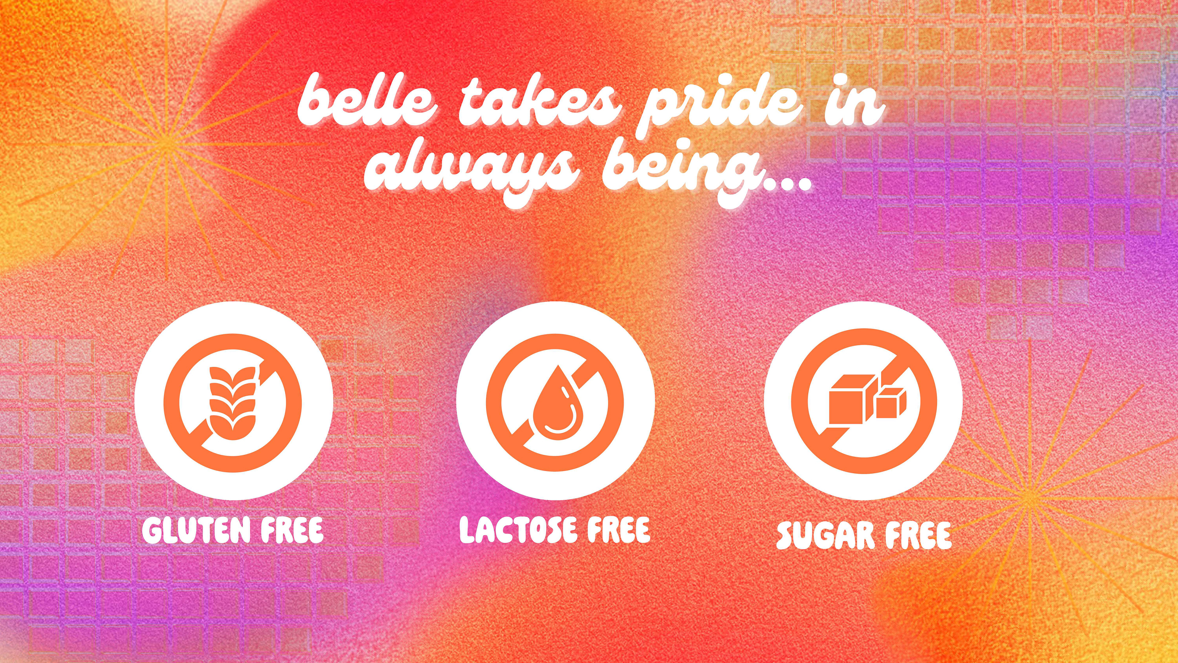
Belle is a probiotic refresher in the fast-growing functional beverage market, designed to support gut health, radiance, and everyday wellness through smooth, approachable formulations that are safe for your belly and delicious on the tongue. I developed Belle as a packaging system with the goal of thoughtfully connecting with consumers who may be new to wellness drinks, creating a product that feels inviting rather than intimidating. While the brand is designed to be for everyone, it subtly leans toward women through its tone, color palette, and softness—reflecting how wellness is often experienced and communicated within that space.
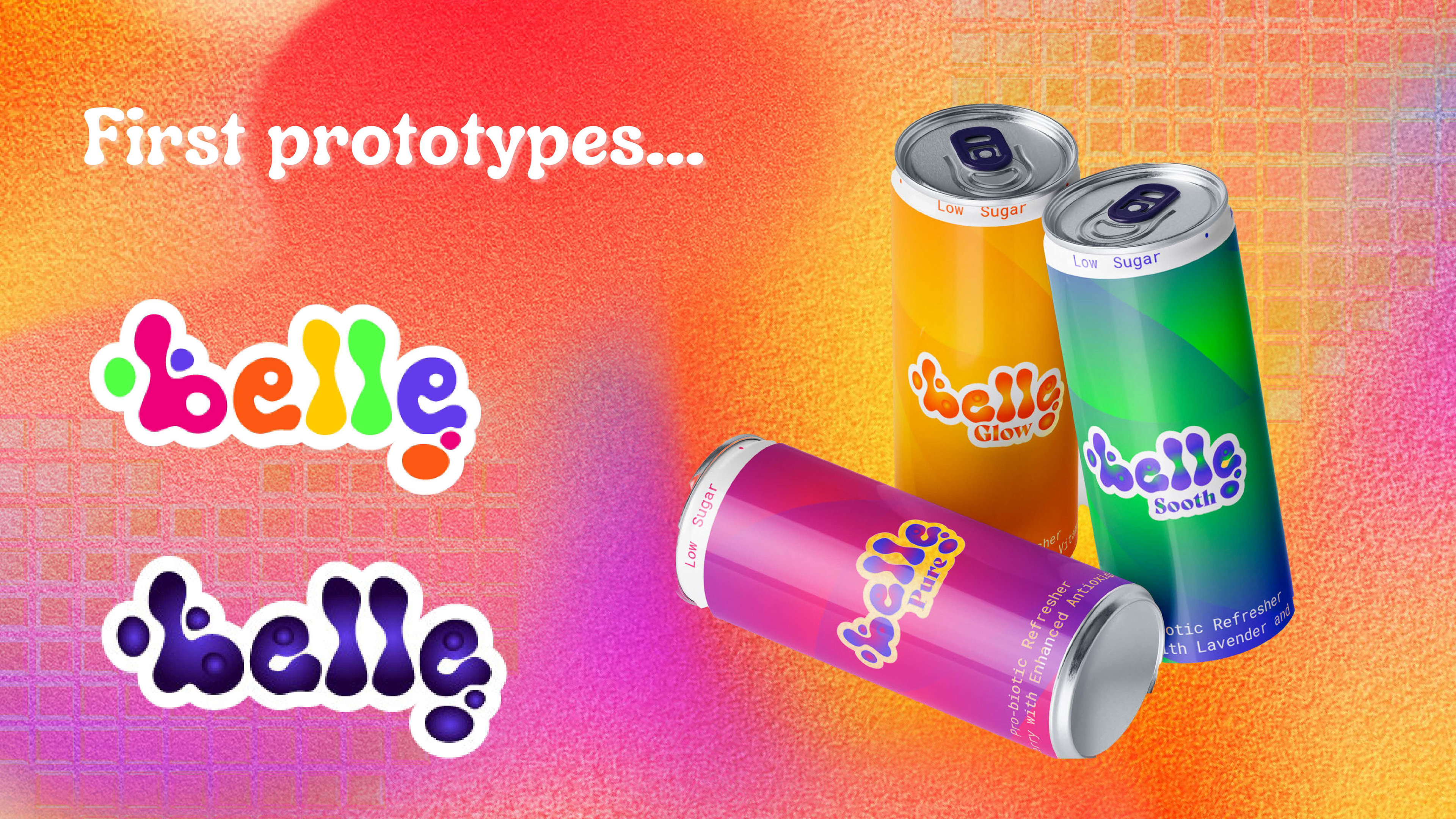
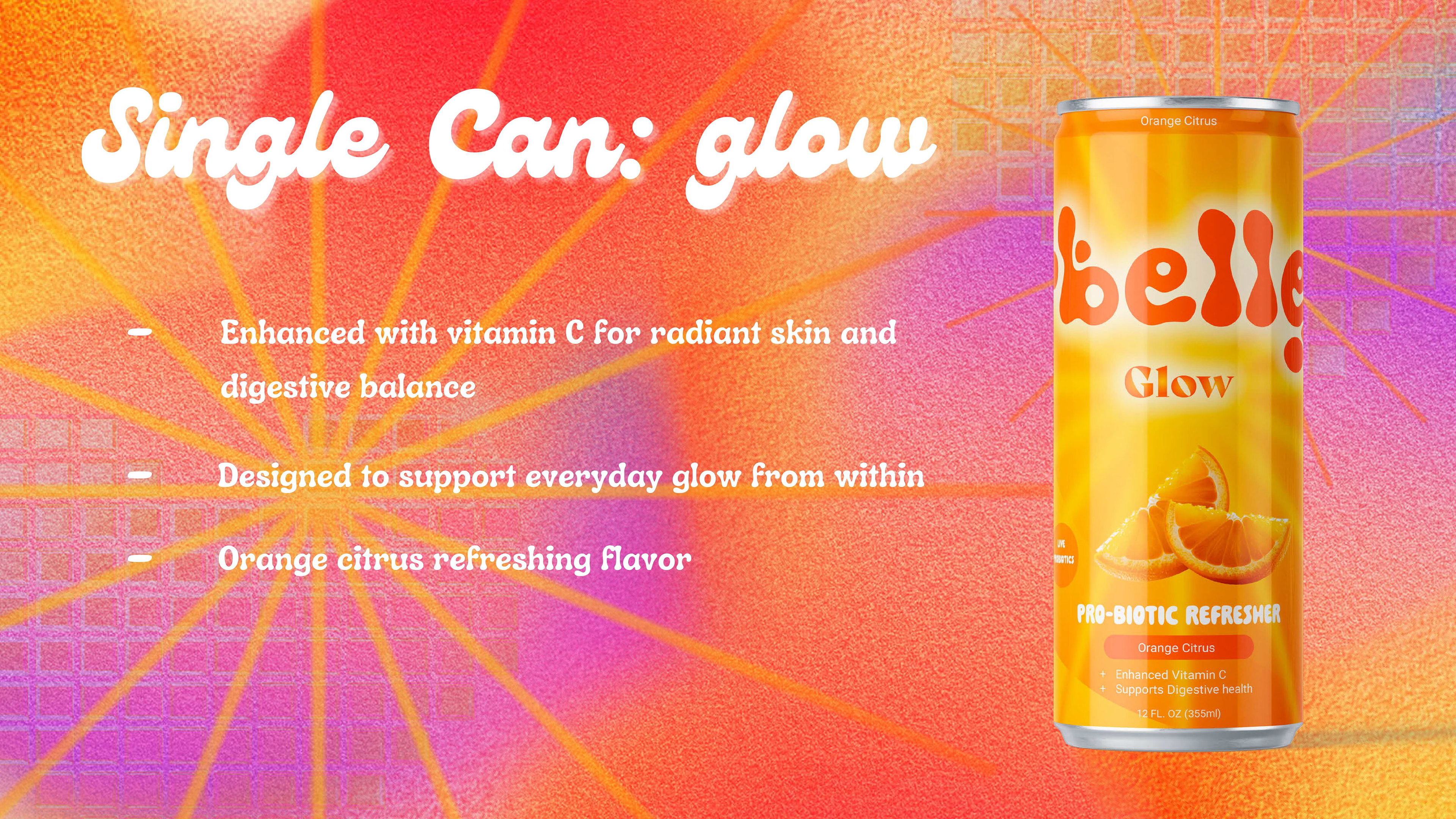
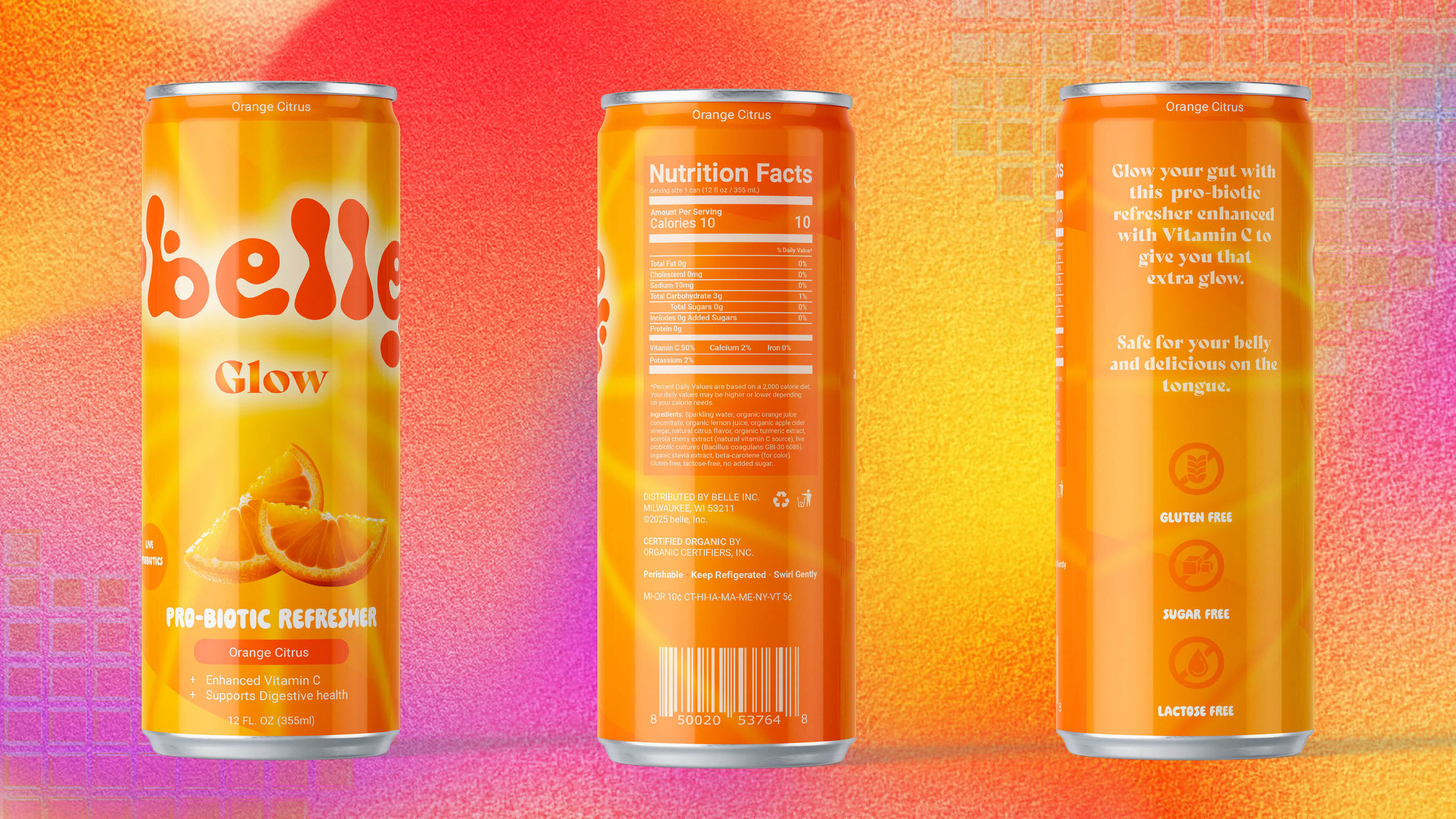
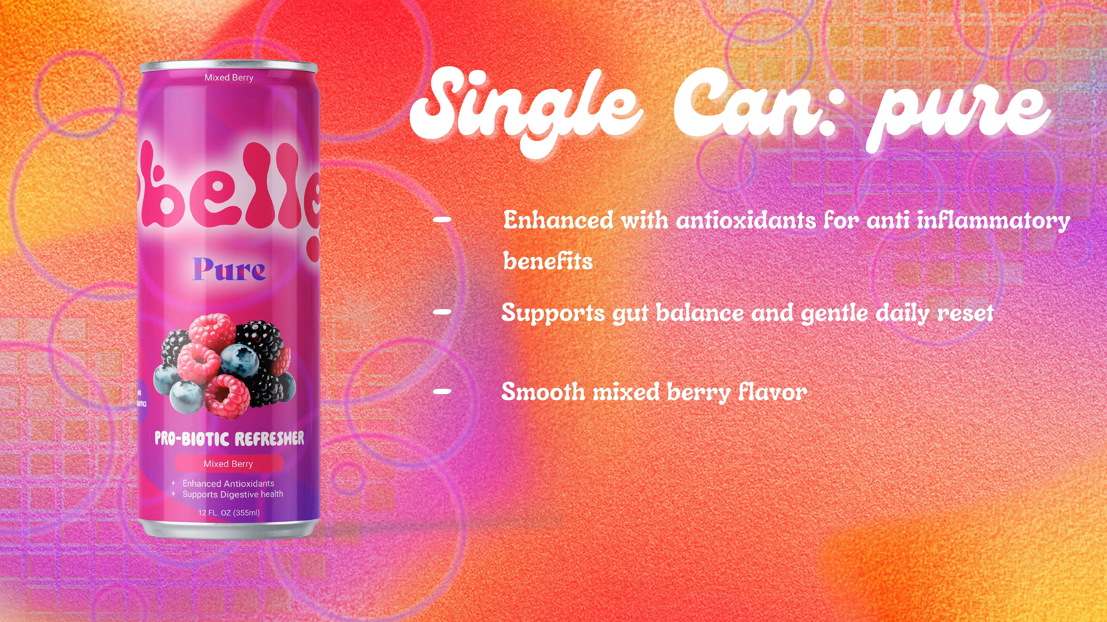
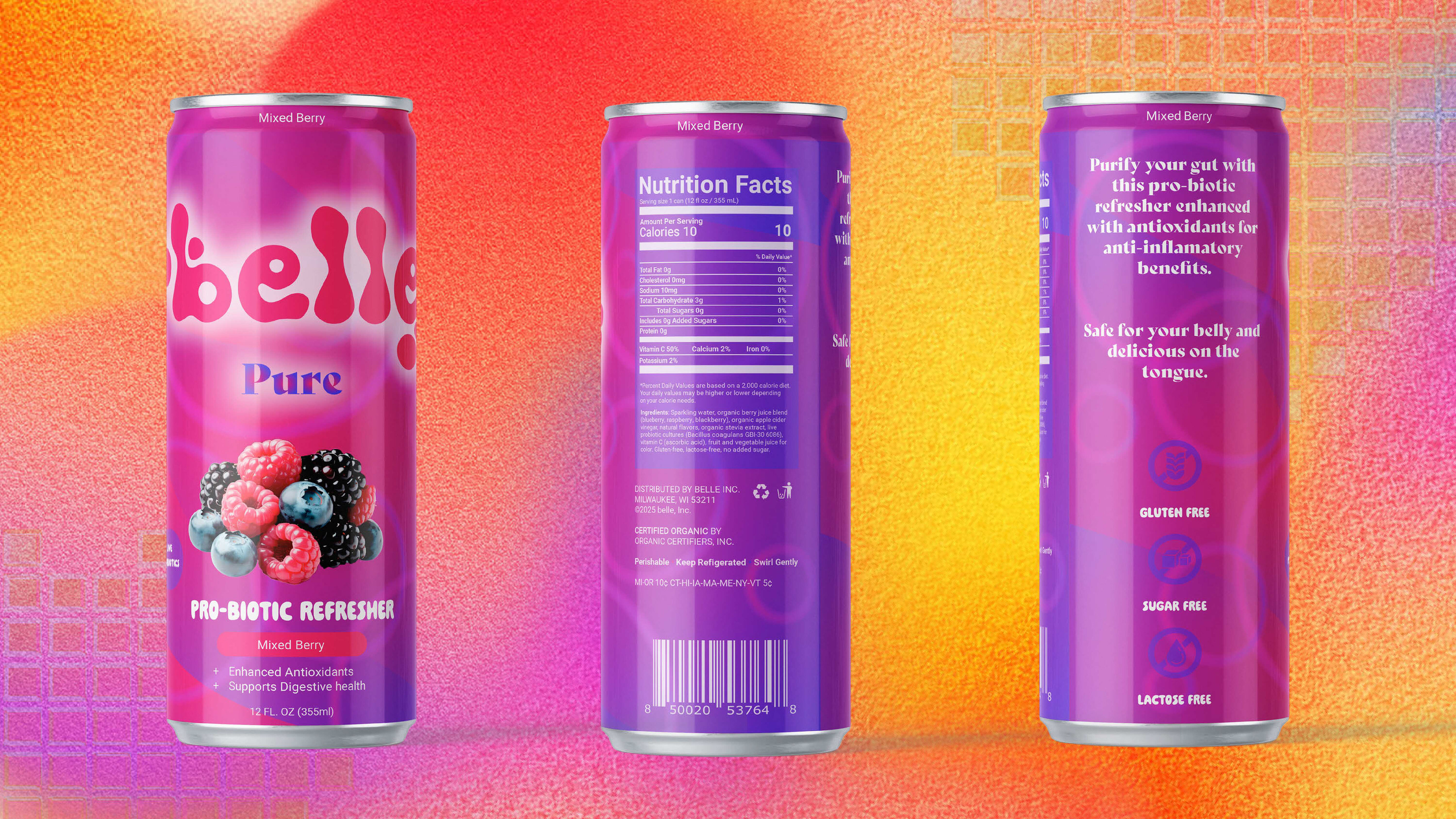
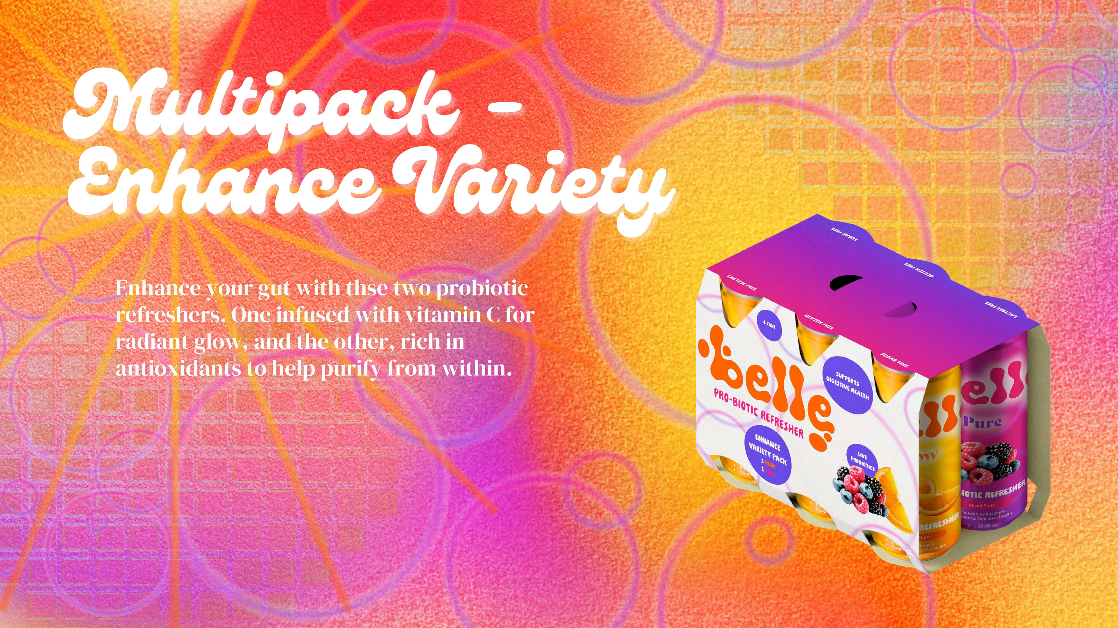
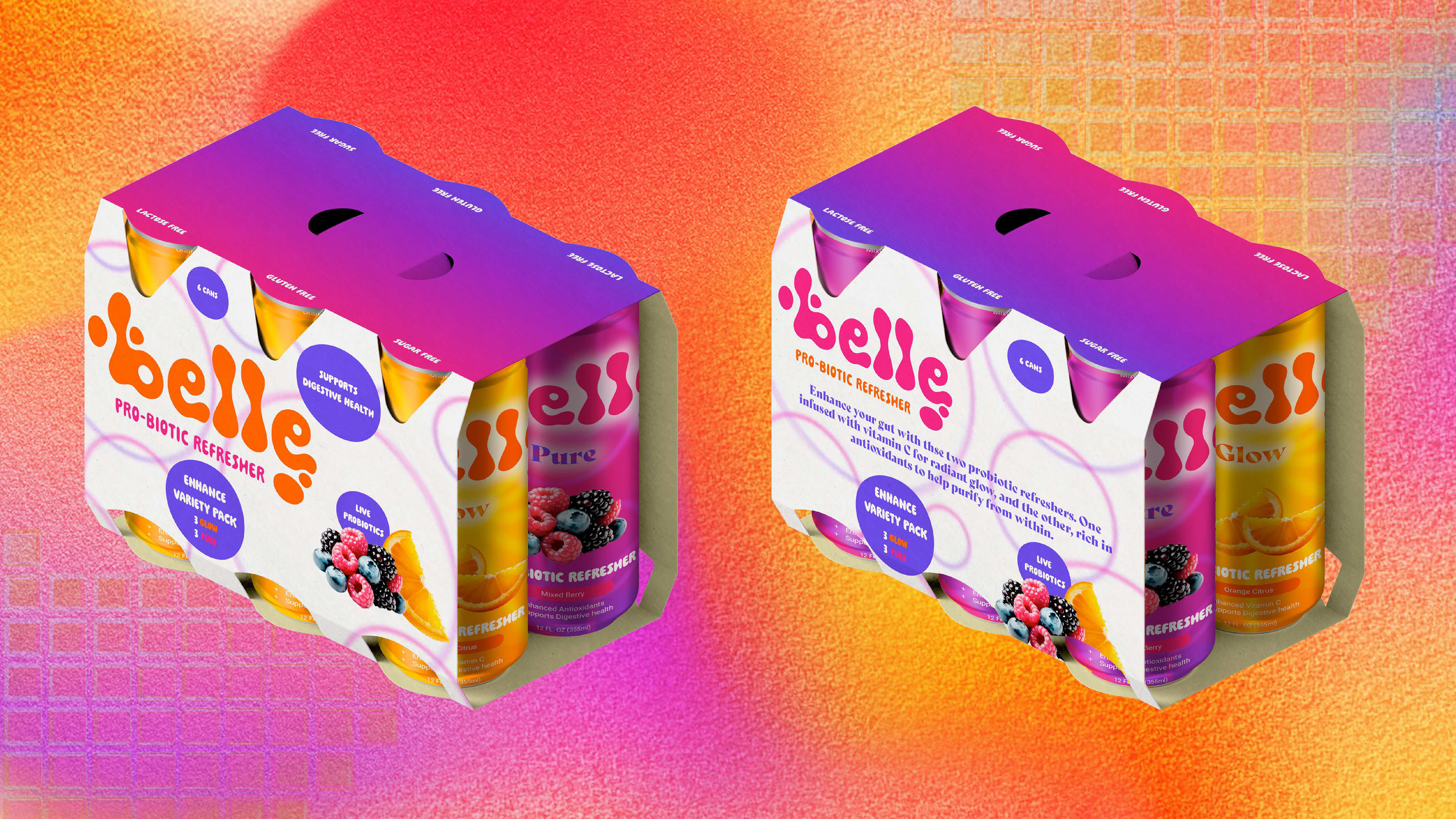
This project is primarily a package design system, with a strong emphasis on shelf presence, clarity, and emotional connection. I designed two core flavors—Glow and Pure—each with its own visual identity and wellness focus while remaining unified through consistent typography, layout, and brand voice. Glow emphasizes radiance and digestive support through vitamin C and citrus notes, while Pure highlights gut purification and anti-inflammatory benefits with antioxidant-rich berry flavors.
Throughout the design process, I was intentional about color psychology, hierarchy, and readability to ensure the packaging felt both trustworthy and warm. My goal was to create packaging that consumers could see themselves in—something supportive, modern, and easy to reach for as part of an everyday routine. The final system allows Belle to grow through future flavors and extensions while remaining grounded in its mission to make wellness feel accessible, friendly, and human.
This project strengthened my experience in packaging design, brand storytelling, and designing with empathy for a real-world audience.